Apps die from a thousand tiny cuts. No settings screen. Unscrollable dialogs on small phones. Categories you can’t tap. Unread notifications that blend into the background.
v0.3.1 fixes those cuts.
This update is about control, discoverability, and polish. The stuff users notice when it’s missing – and appreciate when it’s there.
What We Added
A Real Settings Screen (Finally)
Before: settings scattered or non-existent. Notifications? Good luck finding the toggle. Language? Account deletion? Hidden deep in the drawer.
Now: a dedicated settings screen with:
- Notification preferences: granular controls for what you get
- Language switching: EN/ES/RU (more coming)
- Account deletion: clear path if you need it
No more menu archaeology.
Tappable Category Chips
See a category chip on a task view? Tap it.
That’s it. Browse all tasks in that category instantly. No extra screens, no back-and-forth.
This makes task discovery feel natural, not like work.
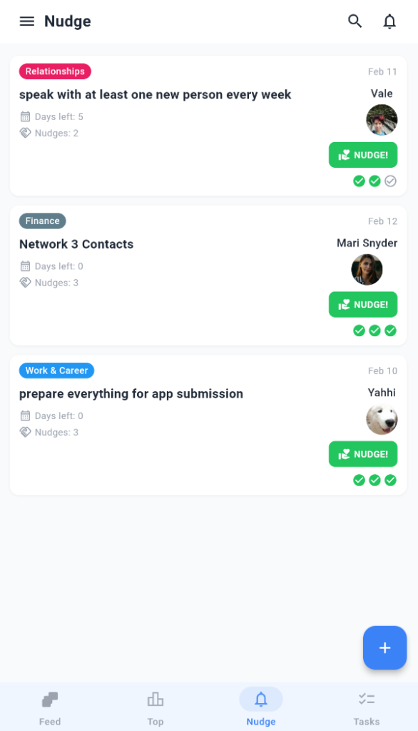
Profile Tasks Show Motivator Status + Actions
Your profile now clearly shows:
- Motivator status for tasks you’re supporting
- Action buttons right there (nudge, thanks, etc.)
Less hunting. More doing.
Visual Flagging for Reported Comments
Reported comments now have a flag icon. Clear, immediate transparency.
You know it’s handled. No wondering.
What We Fixed
Small Screen Sanity
iPhone SE, compact Androids: we’ve been there. Auth dialogs and report sheets wouldn’t scroll.
Fixed. Everything scrolls properly now.
Red Unread Dots
Notification unread indicators were too subtle. Now they’re red. You won’t miss them.
Faster Drawer Navigation
The drawer used to load profile data after you opened it. Felt laggy.
Now it loads upfront. Instant access to your profile from anywhere.
Why This Update Matters
Early versions focus on “does it work?” This version asks “does it feel good?”
- Control (settings)
- Discoverability (tappable categories)
- Polish (small screens, visual cues, speed)
These aren’t sexy. But they’re the difference between “I might use this” and “this is my daily driver.”
What’s Coming
Next up: better matching algorithms, onboarding tweaks, and more granular privacy controls.
We’re shipping weekly now. User feedback drives the roadmap.